Chinese Tattoo Guide · Reviewed against a native Chinese editor's notes
Where to put a Chinese character tattoo
Why placement matters more for Chinese characters than for most designs
A Chinese character is not a picture; it is a set of strokes with specific spacing. Shrink the character or stretch the skin it sits on, and strokes merge. When they merge, the character does not become “slightly off” — it can become a different character or stop being readable at all. Placement is therefore a legibility decision, not just an aesthetic one.
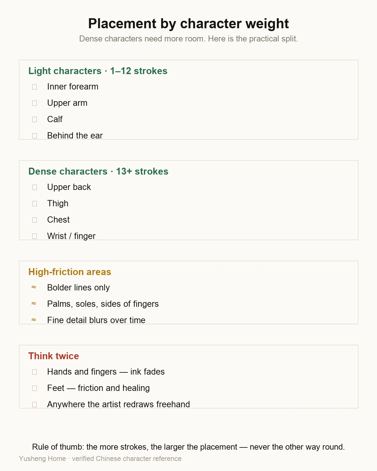
Placement by character weight
| Character type | Examples | Best placement |
|---|---|---|
| Open, few strokes | 勇 · 爱 · 福 · 家 | wrist, forearm, behind ear, ankle |
| Medium density | 信 · 恩 · 和 · 忍 | forearm, calf, shoulder |
| Dense, many strokes | 龍 · 愛 · 學 · four-character idioms | upper back, thigh, chest — areas that allow size |
Areas that hold up well over time
- Forearm (inner or outer). Flat, moderate stretch, easy to size. The most common choice for a single character and the easiest to show or cover.
- Upper back / shoulder blade. Large enough for dense characters and idioms, minimal distortion.
- Calf. Good size, holds strokes well, easy to cover.
- Upper arm. Tolerable pain, good for small-to-medium characters, easy to cover with a sleeve.
Areas to think twice about
- Lower abdomen and ribs. High stretch and higher pain; fine strokes can distort over time.
- Ankle and foot. High friction with shoes, and healing is often slower.
- Fingers and hands. Very small area, fast fading, and frequent friction — a poor match for stroke detail.
- Neck and face. High visibility in professional settings, and in parts of Asia visible tattoos still draw attention in some workplaces.
Layout and direction
- Vertical. Traditional and well suited to single characters or paired words; reads top to bottom.
- Horizontal. Suits longer expressions; reads left to right.
- Never mirrored or rotated. A mirrored character is incorrect, not a stylistic variation.
- Keep proportions. If the design has more than one character, they should be the same size — an uneven layout reads as an error.
Practical checklist before booking
- Decide the character first, then the placement — not the other way around.
- Print the character at the intended size and hold it against the area, in a mirror.
- Check how easily the placement can be covered for work, travel and (in Japan) hot springs.
- Ask the artist how the area heals and how much the skin stretches there.
- Confirm the stencil is followed exactly, without redrawing or rotating the character.
Frequently asked questions
Where is the best place for a Chinese character tattoo?
The forearm, upper back, shoulder blade and calf hold fine strokes well and give the character enough room to read. The best placement is the one that gives your character enough size to stay legible as it ages.
Does placement affect whether the meaning is right?
No — the meaning does not change with placement. What placement changes is legibility: a character squeezed small enough to fit a narrow area can lose the strokes that identify it.
Which areas should I avoid?
Areas that stretch heavily (lower abdomen, ribs, inner thigh) distort fine strokes over time, and areas that rub against clothing or shoes heal unevenly. Small, stroke-dense characters are the worst fit for those placements.
Does the character need to face a certain direction?
Chinese characters are not mirrored or rotated. Vertical layouts read top to bottom and horizontal layouts left to right. Beyond that, character orientation does not carry meaning.
Should the character be vertical or horizontal?
Both are correct. Vertical suits single characters and paired words; horizontal suits longer expressions. What matters is that each character keeps its correct proportions.
Does pain vary by placement?
Yes, considerably. Fleshy areas such as the upper arm and shoulder are usually more tolerable; ribs, spine, ankle and wrist are commonly reported as more painful. This is a comfort factor, not a correctness one.